This summer, Sasha, Lorrie and I started brainstorming the sorts of events we wanted to host at the Center for Civic Media this fall. The first I put on the calendar was a session on “mapping civic media”, a chance to catch up with some of my favorite people who are working to study, understand and visualize how ideas move through the complicated ecosystem of professional and participatory media.
To represent the research being done in the space, we invited Hal Roberts, my collaborator on Media Cloud (and on a wide range of other research), Erhardt Graeff from the Web Ecology project, and Gilad Lotan, VP of R&D for internet analytics firm BetaWorks. On Wednesday night, I asked them to share some of the recent work they’ve been doing, understanding the structure of the US and Russian blogosphere, analyzing the influence networks in Twitter during the early Arab Spring events and understanding the social and political dynamics of hashtags. They didn’t disappoint, and I suspect our video of the session (which we’ll post soon) will be one of the more popular pieces of media we put together this fall. In the meantime, here are my notes, constrained by the fact that I was moderating the panel and so couldn’t lean back and enjoy the presentations the way I otherwise might have.
Hal Roberts is a fellow at the Berkman Center for Internet and Society, where he’s produced great swaths of research on internet filtering, surveillance, threats to freedom of speech, and the basic architecture of the internet. (That he’s written some of these papers with me reflects more on his generosity than on my wisdom.) He’s the lead architect of Media Cloud, the system we’re building at the Berkman Center and at Center for Civic Media to “ask and answer quantitative questions about the mediasphere in more systematic ways.” As Hal explains, media researchers “have been writing one-off scripts and systems to mine data in haphazard ways.” Media Cloud is an attempt to streamline that process, creating a collection of 30,000 blogs and mainstream media sources in English and Russian. “Our goal is to get as much media as possible, so we can ask our own questions and also let others ask questions of our duct tape and bubblegum system.”

Hal’s map of clusters in popular US blogs. An interactive version of this map is available here.
Much of Hal’s work has focused on using the content of media – rather than the structure of its hyperlinks – to map and cluster the mediasphere. He shows us a map of US blogs that cluster into three main areas – news and political blogs, technology blogs and what he calls “the love cluster”. This last cluster is so named because it’s filled with people talking about what they love. Subclusters include knitters, quilters, fans of recipes and photography. The technology cluser breaks down into a Google camp, an iPhone camp and a camp discussing Android Apps. Hal’s visualization shows the words most used in the sources within a cluster, which helps us understand what these clusters are talking about. The Google cluster features words like “SEO, webmaster, facebook, chrome” and others, suggesting the cluster is substantively about Google and its technology projects.
While we might expect the politics and news cluster to divide evenly into left and rightwing camps, it doesn’t. Study the link structure of the left and the right, as Glance and Adamic and later Eszter Hargittai have, and it’s clear that like links to like. But Hal’s research shows that the left and right use very similar language and talk about many of the same topics. This is a novel finding: It’s not that the left and right are talking about entirely different topics – instead they’re arguing over a common agenda, an agenda that’s well represented in mainstream media as well, which suggests the existence of subjects neither the right or left are talking about online.
Building on this finding, Hal and colleagues at Berkman looked at the Russian media sphere, to see if there was a similar overlap in coverage focus between mainstream media and blogs. “Newspapers and the television are subject to strong state control in Russia – we wanted to see if our analysis confirmed that, and whether the blogosphere was providing an alternative public sphere.
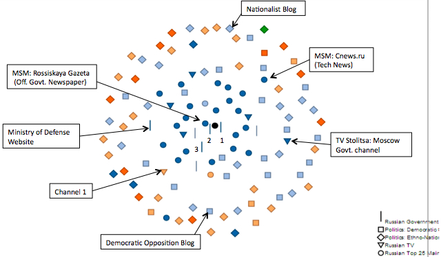
The technique he and Bruce Etling used is “the polar map” – put the source you believe is most important at the center, and other sources are mapped at a distance from that source where the distance reflects degree of similarity. The central dot is a summary of verbiage from Russian government ministry websites. Right next to it is the official government newspaper. TV stations cluster close to the center, while blogs cover a wide array of the space, including the edges of the map.
It’s possible that blogs are showing dissimilarities to the Kremlin agenda because they’re talking about knitting, not about politics. So a further analysis (the one mapped above) explicitly identified democratic opposition and ethno-nationalist blogs and looked at their placement on the map. There’s strong evidence of political conversations far from the government talking points in both the democratic opposition and in the far right nationalist blogosphere.
What’s particularly interesting about this finding is that we don’t see the same pattern in the US blogosphere. Make a polar map with the White House, or a similar proxy for a US government news agenda, at the center, and you’ll see a very different pattern. Some right wing American blogs flock quite closely to the White House talking points – mostly to critique them – while the left blogs and mainstream media generally don’t. However, when Hal and crew did an analysis of stories about Egypt, they saw a very different pattern than in looking at all stories published in these sources. They saw a tight cluster of US mainstream media and blogs – left and right – around the White House. The government, the media and bloggers left and right talked about Egypt using very similar language. In the Russian mediasphere, the pattern was utterly different – the democratic opposition was far from the Kremlin agenda, using the Egyptian protests to talk about potential revolution in Russia.
The ultimate goal of Media Cloud, Hal explains, is to both produce analysis like this, and to make it possible for other researchers to conduct this sort of analysis, without a first step of collecting months or years of data.
Erhardt Graeff is a good example of the sort of researcher Media Cloud would like to serve. He’s cofounder of the Web Ecology Project, which he describes as “as a ragtag group of casual researchers that has now turned in a peer-reviewed publication“. That publication is the result of mapping part of the Twitter ecosystem during the Tunisian and Egyptian revolutions, and attempting to tackle some of the hard problems of mapping media ecosystems in the process.
The Web Ecology Project began life researching the Iranian elections and resulting protests, focusing on the #iranelection hashtag. With a simple manifesto around “reimagining internet studies”, the project tries to understand the “nature and behavior of actors” in media systems. That means considering not just the top users, or even just the registered users of a system like Twitter, but the audience for the media they create. “Each individual user on Twitter has their personal media ecosystem” of people they follow, influence, are followed by and influenced by.
This sort of research rapidly bumps into three hard problems, Erhardt explains:
– Did someone read a piece of information that was published? Or as he puts it, “Did the State Department actually read our report about #IranElection?” It’s very hard to tell. “We end up using proxies – you followed a link, but that doesn’t mean you read it.”
– Which piece of media influenced someone to access other media? “Which tweet convinced me to follow the new Maru video, Erhardt’s or MC Hammer’s?”
– How does the media ecosystem change day to day? Or, referencing a Web Ecology paper, “How many genitalia were on ChatRoulette today?” The answer can vary sharply day to day, raising tough problems around generating a usable sample.
The paper Erhardt published with Gilad and other Web Ecology Project members looks at the Twitter ecosystem around the protest movements in Tunisia and Egypt. By quantitatively searhing for information flows, and qualitatively classifying different types of actors in that ecosystem, the research tries to untangle the puzzle of how (some) individuals used (one type of) social media in the context of a major protest.
To study the space, the team downloaded hundreds of thousands of tweets, representing roughly 40,000 users talking about Tunisia and 62,000 talking about Egypt. They used a “shingling” method of comparison to determine who was retweeting whom ad sought out the longest retweet chains. They looked at the top 10% of these chains in terms of length to find the “really massive, complex flows” and grabbed a random 1/6th of that sample. That yielded 774 users talking about Tunisia, 888 talking about Egypt… and only 963 unique users, suggesting a large overlap between those two sets.
Then Erhardt, Gilad and others started manually coding the participants in the chains. Categories included Mainstream Media (@AJEnglish, @nytimes), web news organizations (@HuffingtonPost), non-media organizations (@Wikileaks, @Vodaphone), bloggers, activists, digerati, political actors, celebrities, researchers, bots… and a too-broad unclassified category of “others”. This wasn’t an easy process – Erhardt describes a system in which researchers compared their codings to ensure a level of intercoder reliability, then had broader discussions on harder and harder edge cases. They used a leaderboard to track how many cases they’d each coded, and goaded those slow to participate into action.
The actors they classified are a very influential set of Twitter users. The average organization in their set has 4004 followers, the average individual 2340 (which is WAY more than the average user of the system). To examine influence with more subtlety than simply counting followers, Erhardt and his colleagues use retweets per tweet as an influence metric. What they conclude, in part, is that “mainstream media is a hit machine, as are digerati – what they have to say tends to be highly amplified.”
The bulk of the paper traces information flows started by specific people. In the case of Egypt, lots of information flows start from journalists, bloggers and activists, with bots as a lesser, but important, influence. In Tunisia, there were fewer flows started by journalists, more by bots and bloggers, and way fewer from activists. This may reflect the fact that the Tunisian story caught many journalists and activists by surprise – they were late to the story, and less significant as information sources than the bloggers who cover that space over time. By the time Egypt becomes a story, journalists realized the significance and were on the ground, providing original content on Twitter, as well as to their papers.
One of the most interesting aspects of the paper is an analysis of who retweets whom. It’s not surprising to hear that like retweets like – journalists retweet journalists, while bloggers retweet bloggers. Bloggers were much more likely to retweet journalists on the topic of Egypt than on Tunisia, possibly because MSM coverage of Egypt was so much more thorough than the superficial coverage of Tunisia.
While Gilad Lotan worked with Erhardt on the Tunisia and Egypt paper, his comments at Civic Media focused on the larger space of data analysis. “I work primarily on data – heaps and mounds of data,” he explains, for two different masters. Roughly half his work is for clients, media outlets who want to understand how to interact and engage with their audiences. The other half focuses on developing the math and algorithms to understand the social media space.
This work is increasingly important because “attention is the bottleneck in a world where threshhold to publishing is near zero.” If you want to be a successful brand or a viable social movement, understanding how people manage their attention is key: “It’s impossible to simply demand attention – you have to understand the dynamics of attention in the face of this bottleneck.”
Gilad references Alex Dragulescu’s work on digital portraits, pictures of people composed of the words they most tweet or share on social media. He’s interested not just in the individuals, but in the networks of people, showing us a visualization of tweets around Occupy Wall Street. Different networks take form in the space of minutes or hours as new news breaks – the network around a threatened shutdown of Zuccotti Park for a cleanup is utterly different than the network in July, when Adbusters was the leading actor in the space.

Lotan’s visualizations of Twitter conversations about Occupy in July and October 2011
Images like this, Lotan suggests, “are like images of earth from the moon. We knew what earth looked like, but we never saw it
We knew we lived in networks, but this is the first time we can envision it and see how it plays out.”
When we analyze huge data sets, we can start approaching answers to very difficult questions, like:
– What’s the audience of the New York Times versus Fox News?
– What type of content gains wider audiences through social media?
– What topics do certain outlets cover? What are their strengths, weaknesses and biases?
– How do audiences differ between different publications? How are they similar?
– How fast does news spread, and how does it break?
Much of media and communications research addresses these questions, though rarely directly – as Erhardt noted, we generally address these questions via proxies. But Lotan tells us, we can now ask and answer questions like, “How many Twitter users follow Justin Bieber and The Economist?” The answer, to a high degree of precision, is 46,000. It’s just shy of the number who follow The Economist and the New York Times, 54,000.
Lotan is able to research answers like this because his lab has access to the Twitter “firehose” (the stream of all public data posted to Twitter, moment to moment) and to the bit.ly firehose. This second information source allows Lotan to study what people are clicking on, not just what media they’re exposed to. He offers a LOLcat, where the feline in question is dressed in a chicken costume. “We can see the kitty in you, and the chicken you’re hiding behind.” What people share and what they click is very different, and Lotan is able to analyze both.

This data allowed Lotan to compare what audiences for four major news outlets were interested in, my measuring their clickstreams. Al Jazeera and The Economist, he tells us, are pretty much what you’d think. But Fox News watchers are fascinated by crime, murders, kidnappings and other dark news. This sort of insight may help networks understand and optimise for their audiences. Al Jazeera’s audience, he tells us, is very engaged, tweeting and sharing stories, while Fox’s audience reads a lot and shares very little.
Some of Lotan’s recent research is about algorithmic curation, specifically Twitter’s trending topics. Many observers of the Occupy movement have posited that Twitter is censoring tweets featuring the #occupywallstreet hashtag. Lotan acknowledges that the tag has been active, but suggests reasons why it’s never trended globally. Interest in the tag has grown steadily, and has a regular heartbeat, connected to who’s active on the east coast of the US. The tag has spiked at times, but remains invisible in part due to bad timing – a spike on October 1st was tiny in comparison to “#WhatYouShouldKnowAboutMe”, trending at the same time.
At this point, Lotan believes he’s partially reverse engineered the Trending Topics algorithm. The algorithm is very sensitive to the new, not to the slowly building. This raises the question: what does it mean to “get the math right”. Lotan observes, “Twitter doesn’t want to be a media outlet, but they made an algorithmic choice that makes them an editor.” He’s quick to point out that algorithmic curation is often very helpful – the Twitter algorithm is quite good at preventing spam attacks, which have a different signature than organic trends. So we see organic, fast-moving trends, even when they’re quite offensive. He points to #blamethemuslims, which started when a Muslim women in the UK snarkily observed that Muslims would be blamed for the Norway terror attacks. That tweet died out quickly, but was revived by Americans who used the tag unironically, suggesting that we blame Muslims for lots of different things – that small bump, then massive spike is a fairly common organic pattern… and very different from the spam patterns he’s seen on Twitter.
When we analyze networks, Lotan suggests, we encounter a paradox that James Gleick addresses in his recent book on information: just because I’m one hop away from you in a social network doesn’t mean I can send you information and expect you to pay attention. In the real world, people who can bridge between conversations are rare, important and powerful. He closes his talk with the map of a Twitter conversation about an event in Israel where settlers were killed. There’s a large conversation in the Israeli twittersphere, a small conversation in the Palestinian community, and two or three bridge figures attempting to connect the conversations. (One is my wife, @velveteenrabbi.) Studying events like this one may help us, ultimately, determine who’s able to build bridges between these conversations.
I can’t wait for the video for this event to be put online – we’ll get it up as soon as possible and I’ll link to it once we do.
Pingback: Arab Spring: What Did We Learn About Tech and Revolution? | The Meta-Activism Project
Pingback: Jonathan Stray » What should the digital public sphere do?
Pingback: #OccupyData Hackathon at the Center for Civic Media « Which Light
Comments are closed.